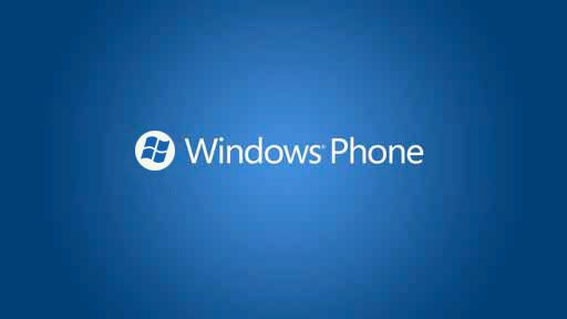
นอกจากโนเกียได้เปิดตัวสมาร์ทโฟนรุ่น N9-00 ในงานดังกล่าวโนเกียยังแอบเผยโลโก้ใหม่ของ Windows Phone ด้วย โดยโลโก้ Windows จะอยู่บนพื้นสี่เหลี่ยมจัตุรัสสีขาว จากเดิมโลโก้ Windows จะอยู่บนพื้นรูปวงกลมนูนสี่น้ำเงินหรือสีเขียว
อนึง เมื่องานเปิดตัว Windows Phone "Mango" ของไมโครซอฟท์เอง ก็มีคนตาดีเห็นภาพโลโก้ใหม่เช่นกัน
ที่มา: e’s Phoneblog ผ่าน WMPoweuser
![]()


ดูเข้ากับ UI ดี
gunornor Wed, 22/06/2011 - 05:53
ดูเข้ากับ UI ดี
อันนี้จริงครับ
phukapond Wed, 22/06/2011 - 07:20
In reply to ดูเข้ากับ UI ดี by gunornor
อันนี้จริงครับ
+1 ลายเซ็น
dafty Wed, 22/06/2011 - 11:28
In reply to อันนี้จริงครับ by phukapond
+1 ลายเซ็น
ชอบ
KavkaZ Wed, 22/06/2011 - 07:03
ชอบ
กรอบสี่เหลี่ยมมันเอียงหรือผมส
aeke88 Wed, 22/06/2011 - 07:40
กรอบสี่เหลี่ยมมันเอียงหรือผมสายตาเอียงหว่า
ไม่เอียงนิครับ
ronghankaew Wed, 22/06/2011 - 07:50
In reply to กรอบสี่เหลี่ยมมันเอียงหรือผมส by aeke88
ไม่เอียงนิครับ
ผมก็ว่ามันเอียงนะ
onimaru Wed, 22/06/2011 - 08:02
In reply to กรอบสี่เหลี่ยมมันเอียงหรือผมส by aeke88
ผมก็ว่ามันเอียงนะ สงสัยคนออกแบบทำงานดึก เบลอ มันเลยออกมาเอียง
editเน้อ พอท่านข้างบนมาบอกมันไม่เอียง ผมถึงกับเอาไม้บรรทัดมาวัดกันเลยทีเดียว ไม่เอียงจริง ๆ ด้วย
ไม่เอียงจริงดิ
Bluetus Wed, 22/06/2011 - 09:18
In reply to กรอบสี่เหลี่ยมมันเอียงหรือผมส by aeke88
ไม่เอียงจริงดิ ทำไมผมมองว่าเอียงด้วย...
ผมก็มองว่าเอียงเหมือนกันครับ
kukiTi14 Wed, 22/06/2011 - 09:26
In reply to ไม่เอียงจริงดิ by Bluetus
ผมก็มองว่าเอียงเหมือนกันครับ ^^
เอียงซ้ายเมียด่า?
supatee Wed, 22/06/2011 - 09:54
In reply to ผมก็มองว่าเอียงเหมือนกันครับ by kukiTi14
เอียงซ้ายเมียด่า?
ผมก็มองว่าเอียงซ้ายนิดๆครับ
planktons Wed, 22/06/2011 - 09:38
In reply to กรอบสี่เหลี่ยมมันเอียงหรือผมส by aeke88
ผมก็มองว่าเอียงซ้ายนิดๆครับ
ผมก็มองว่าเอียงซ้ายนิดๆครับ
planktons Wed, 22/06/2011 - 09:38
In reply to กรอบสี่เหลี่ยมมันเอียงหรือผมส by aeke88
ผมก็มองว่าเอียงซ้ายนิดๆครับ
ตัว logo
Orion Wed, 22/06/2011 - 09:48
In reply to กรอบสี่เหลี่ยมมันเอียงหรือผมส by aeke88
ตัว logo วินโดส์มันเอียงทำให้กรอบดูเอียงกลายเป็นเป็นภาพลวงตาซะงั้น
ผมดูแล้ว ไม่เอียงนะ
moosaTAE Wed, 22/06/2011 - 10:12
In reply to กรอบสี่เหลี่ยมมันเอียงหรือผมส by aeke88
ผมดูแล้ว ไม่เอียงนะ อาจจะเป็นเพราะโลโก้ Windows มันเลยทำให้ดูเอียง ๆ มากกว่ามั้ง
ผมว่า มันหลอกตา
TeamKiller Wed, 22/06/2011 - 11:06
In reply to กรอบสี่เหลี่ยมมันเอียงหรือผมส by aeke88
ผมว่า มันหลอกตา ว่ามันเอียงเพราะ logo ข้างในมันเอียง แล้วขอบดันภาพแตกๆ มีขอบ
ผู้ชายหลายๆคนในนี้
Bluetus Wed, 22/06/2011 - 11:11
In reply to กรอบสี่เหลี่ยมมันเอียงหรือผมส by aeke88
ผู้ชายหลายๆคนในนี้ กำลังบอกว่า(สายตา)เอียงซ้าย ฮี่ฮี่... XD
เอียงซ้ายแม่ยายชอบครับ...
Perl Wed, 22/06/2011 - 13:29
In reply to กรอบสี่เหลี่ยมมันเอียงหรือผมส by aeke88
เอียงซ้ายแม่ยายชอบครับ...
ผมมองแวบแรกก็เห็นว่ามันเอียงเ
Pinery Wed, 22/06/2011 - 16:41
In reply to กรอบสี่เหลี่ยมมันเอียงหรือผมส by aeke88
ผมมองแวบแรกก็เห็นว่ามันเอียงเลยเหมือนกัน 0_0
Nokia ใหญ่จริงๆ
naritai Wed, 22/06/2011 - 09:28
Nokia ใหญ่จริงๆ
ฟอนต์ที่ใช้คล้าย Nokia Pure
touchie Wed, 22/06/2011 - 12:00
ฟอนต์ที่ใช้คล้าย Nokia Pure เอามากๆ....
ดูเรียบง่ายดี
joomla Wed, 22/06/2011 - 12:08
ดูเรียบง่ายดี
ลองตี้เส้นดุเเล้ว
omoboy Wed, 22/06/2011 - 17:21
ลองตี้เส้นดุเเล้ว ไม่เองจริงๆครับ อาจจะเป็นเพราะโลกโก้ รูปธงของวินโดวส์หลอกตา บวกกับสีพื้นหลังที่ไล่กัน มาบรรจบพอดีกับโลโก้ เลยทำให้ดูเหมือนว่าเอียง
+1 ให้ครับ
S.T.E.Y.R.C. Wed, 22/06/2011 - 19:28
In reply to ลองตี้เส้นดุเเล้ว by omoboy
+1 ให้ครับ
เห็นหลายท่านบ่นเรื่อง
Jose Wed, 22/06/2011 - 19:42
เห็นหลายท่านบ่นเรื่อง โลโก้ลวงตา ทำให้ดูเหมือนกรอบสี่เหลี่ยมเอียง
ผมเลยลองเปลี่ยนให้เป็นวงกลม ดู คิดว่า หายเอียงมั้ยอ่ะครับ
ปล.ลองทำเล่นๆ หน่ะครับ ^_^
วงกลมมันไม่มีเอียงอยู่แล้วนี่
Pinery Wed, 22/06/2011 - 21:11
In reply to เห็นหลายท่านบ่นเรื่อง by Jose
วงกลมมันไม่มีเอียงอยู่แล้วนี่ครับ ^ ^"
หมายถึงทำให้ไม่มีอะไรดูหลอกตา
Jose Wed, 22/06/2011 - 21:17
In reply to เห็นหลายท่านบ่นเรื่อง by Jose
หมายถึงทำให้ไม่มีอะไรดูหลอกตา อ่ะครับ
อ้อครับ
Pinery Wed, 22/06/2011 - 21:23
In reply to หมายถึงทำให้ไม่มีอะไรดูหลอกตา by Jose
อ้อครับ ^^
ปกติผมชอบวงกลมมากกว่านะ